Agile Coaching Dashboard - How I Started
I was first introduced to the concept of an agile coaching dashboard at the Agile 2012 conference, and it was presented as a type of information radiator to help agile coaches and the teams they work with visualize coaching work and progress. I work with a large number of teams, and there isn’t a single location where I could post an information radiator for most of them to see—I tried, and it flopped. But I was still curious about how I could visualize my work with the teams for my own benefit, so I decided to house the dashboard in my cubicle.
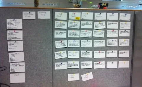
At this particular client organization, the agile coaches use an agile assessment framework to help teams inspect and adapt their agile practices. The assessment consists of 5 focus areas, which seemed like a good way for me to organize my work. I wrote down each focus area on a 4x6 index card with some bullet points about what was included in that area and hung them vertically in my cubicle: I had my y-axis. Then I wrote down the team names on cards and hung those horizontally; I think at the time I was coaching about 8 teams. This formed a matrix that I could then fill in and looked something like this:
Within the grid, I wrote short notes about what I thought a team needed help with next. Every 1-2 weeks, I would review the cards and evaluate what progress had been made. I could see similarities and differences amongst the teams, which was helpful in determining what training needs existed. It became easier to see what topics would be beneficial to cover in the organization’s monthly lunch and learns.
The coaching dashboard was helpful for me to reflect on my work, and it evolved over time (more to come).


